PT
A MARCA
Aporá é uma incorporadora de Curitiba (PR) dedicada a desenvolver e implantar condomínios e loteamentos horizontais. Resgatar um viver mais livre, amplo e tranquilo é a principal proposta de seus empreendimentos.
EN
THE BRAND
Aporá is a Brazil-based real estate developer located in Curitiba (PR), dedicated to developing and implementing condominiums and horizontal subdivisions. The main proposition of its ventures is to reclaim a lifestyle that is more free, spacious, and tranquil.


PT
DESAFIO
Com mais de 30 anos de experiência no desenvolvimento e entrega de empreendimentos imobiliários, surgiu o interesse em criar uma empresa focada em empreendimentos residenciais horizontais. O desafio inicial foi estruturar a arquitetura de marcas, compreendendo as frentes de negócio e seus públicos para definir as marcas necessárias e estabelecer a relação entre cada uma delas. A partir disso, o objetivo foi construir uma comunicação sólida e consistente, refletindo o propósito do negócio e gerando credibilidade em um mercado tradicional.
EN
CHALLENGE
With over 30 years of experience in the development and delivery of real estate projects, there was an interest in creating a company dedicated to horizontal residential developments. The initial challenge was to structure the brand architecture, understanding the business fronts and their audiences to define the necessary brands and establish the relationship between each of them. From this point, the goal was to build a strong and consistent communication that reflects the business purpose and generates credibility in a traditional market.
PT
ESTRATÉGIA
Compreendemos que a Aporá tem como propósito oferecer uma nova forma de viver, contribuindo com o planejamento urbano e com o desenvolvimento de uma sociedade mais próspera.
Partindo da ideia de transformar paisagens para criar espaços e conexões relevantes, identificamos a oportunidade de estabelecer uma comunicação dinâmica, otimista e acolhedora. Outro ponto-chave foi compreender que o lado inspirador da marca se equilibra com uma abordagem prática e realista, fortalecendo a credibilidade e permitindo a construção de um discurso único e diferenciado.
EN
STRATEGY
We understand that Aporá aims to offer a new way of living, contributing to urban planning and the development of a more prosperous society.
Building on the idea of transforming landscapes to create meaningful spaces and connections, we identified the opportunity to establish dynamic, optimistic, and welcoming communication. Another key point was to comprehend that the inspiring aspect of the brand is balanced with a practical and realistic approach, strengthening credibility and allowing the construction of a unique and differentiated discourse.
Building on the idea of transforming landscapes to create meaningful spaces and connections, we identified the opportunity to establish dynamic, optimistic, and welcoming communication. Another key point was to comprehend that the inspiring aspect of the brand is balanced with a practical and realistic approach, strengthening credibility and allowing the construction of a unique and differentiated discourse.

PT
NOME
Aporá, que no tupi significa “monte bonito” sintetiza perfeitamente a essência da empresa. Ele reforça o olhar para o futuro com otimismo e o impacto positivo que a incorporadora busca gerar: comunidades harmoniosas, natureza valorizada e cenários deslumbrantes.
EN
NAMING
"Aporá," which means "beautiful hill" in Tupi - an indigenous Brazilian language - perfectly encapsulates the essence of the company. It reinforces a forward-looking perspective with optimism and the positive impact that the real estate developer seeks to generate: harmonious communities, cherished nature, and breathtaking landscapes.

PT
TAGLINE
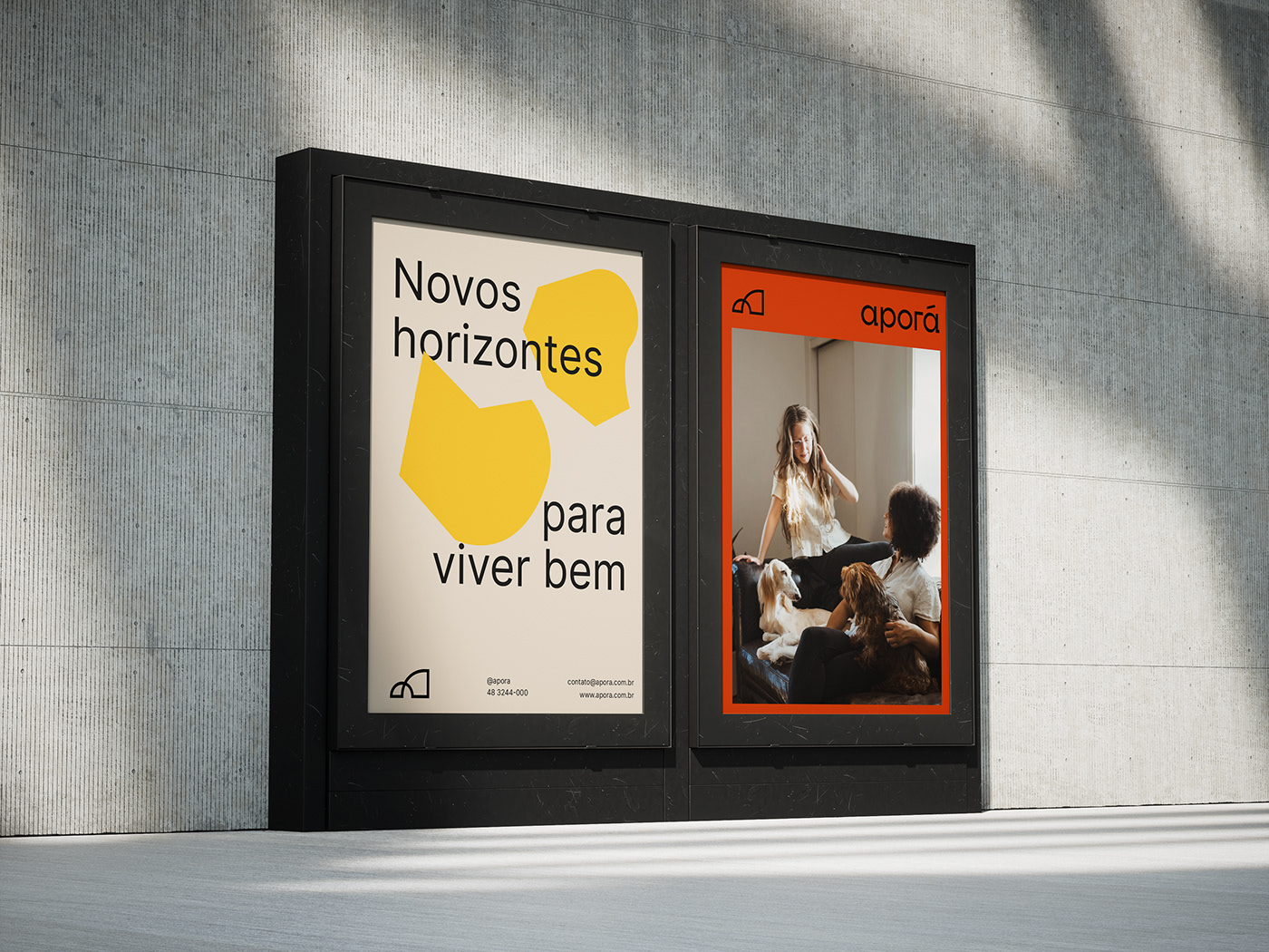
A tagline Novos horizontes para viver bem reflete o compromisso com a transformação e o bem-estar. Além de remeter aos empreendimentos horizontais, o principal foco do negócio, evoca a ideia de alcançar novas conquistas e viver com harmonia e qualidade de vida.
EN
TAGLINE
The tagline New Horizons for Living Well reflects the commitment to transformation and living a fulfilling life. Besides alluding to horizontal developments, the core focus of the business, it evokes the idea of achieving new accomplishments and living with harmony and quality of life.

PT
LOGOTIPO
Com traços minimalistas e tipografia sem serifa, buscamos transmitir estabilidade e praticidade. A escrita em caixa baixa, além de conferir um aspecto acessível à marca, remete à horizontalidade de seus empreendimentos.
EN
LOGOTYPE
With minimalist lines and sans-serif typography, we aim to convey stability and practicality. The use of lowercase writing not only gives an approachable aspect to the brand but also alludes to the horizontal nature of its ventures.


PT
SÍMBOLO
SÍMBOLO
Com uma geometria simples, leve e pregnante, foi desenvolvido da combinação entre “monte” (da etimologia da palavra Aporá) e sua letra inicial “A”. A variação entre curvas e ângulos retos busca transmitir o conceito de transformação, representando a reinvenção de paisagens e novas conquistas para as pessoas.
EN
SYMBOL
With a simple, light, and impactful geometry, the symbol was developed from a combination of "mount" (from the etymology of the word Aporá) and its initial letter "A." The variation between curves and right angles seeks to convey the concept of transformation, representing the reinvention of landscapes and new achievements for people.


PT
PALETA CROMÁTICA
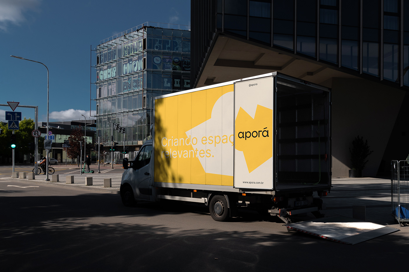
É composta por três cores principais (Preto, Areia e Amarelo Sol) e um tom secundário (Vermelho Terra). Com o Amarelo Sol, além de reforçar o otimismo, resolvemos a questão de desempenho no ambiente físico e digital. Por fim, com o tom Vermelho Terra trazemos calor e dinamismo à identidade.
EN
Color Palette
It is composed of three main colors (Black, Sand, and Sun Yellow) and a secondary shade (Earth Red). With Sun Yellow, in addition to reinforcing optimism, we addressed the performance issue in both physical and digital environments. Finally, with the Earth Red tone, we bring warmth and dynamism to the identity.


PT
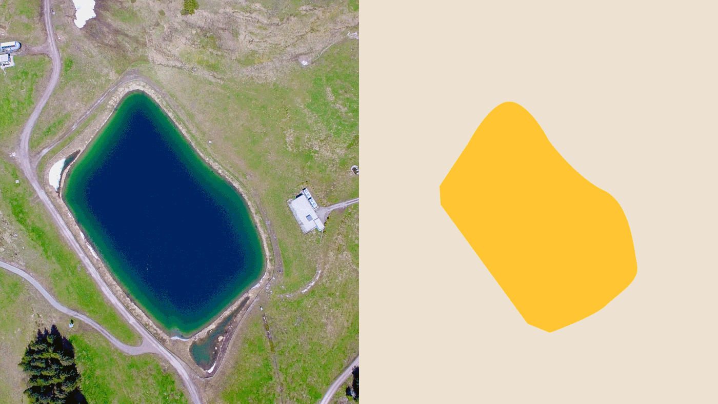
ELEMENTOS ACESSÓRIOS
Utilizamos o espaço físico como uma metáfora visual. O desenho de cada elemento utiliza como base formas da natureza e de construções (como terrenos, lagos, árvores e casas) presentes nos empreendimentos da Aporá. São utilizados como janelas para fotos ou como elemento gráfico para compor layouts. Esse recurso confere dinamicidade e organicidade à identidade da marca, podendo ser expandido e modificado conforme necessário.
EN
ACCESSORY ELEMENTS
We use physical space as a visual metaphor. The design of each element is based on forms found in nature and constructions (such as terrains, lakes, trees, and houses) present in Aporá's developments. These elements are used as windows for photos or as graphic elements to compose layouts. This resource adds dynamism and organicity to the brand identity, adaptable and modifiable as needed.